This month: Gerstaecker Aquarell Fine Studio Watercolours
Gerstaecker Aquarell Fine Studio watercolours
Watercolours are an ancient medium if you think of them as basically coloured pigment, suspended in water. Western artists began using a form of watercolour in the 1400’s, when each artist had to make up their own paints by preparing and grinding down pigments and binding them together. There were probably hundreds of different recipes, and artists kept their favourite recipes and methods to themselves, meaning there was no standard approach for a long time. By the 18th century, early manufacturers like William Reeves, set up shop and began to produce commercially made paints including hard cakes of watercolour, with a little honey added as a softening agent.
To begin with artists would have had to break off chunks of colour and grind them up themselves, but soon manufacturers began to produce artists’ paints that were pretty much ready to use, and the discovery that adding glycerine softened the watercolour ‘cakes’ and made them much more usable, was a breakthrough. By the late 1830’s watercolours were readily available in sets and they soon became very popular as a genteel pastime.
To begin with, professional artists tended to see watercolours as a medium for sketching and making rough versions for final paintings. Albrecht Durer (1471-1528) was an early painter in watercolour; producing botanical, wildlife and landscape sketches and in the 18th and 19th centuries watercolours gained significance with painters like JMW Turner using them in his travel journals and sketchbooks especially.
Watercolour pans and washes
Modern Watercolours are made up of the following ingredients:
- Pigments-as with all art materials the pigments or pure colours are the key ingredient, and they can be natural, synthetic, mineral or organic. They are incredibly finely ground to produce microscopic particles.
- Binder-usually Gum Arabic, which helps to hold the particles of pigment together and fix them onto the painting surface.
- Plasticiser-This softens the dried Gum Arabic and helps the paint dissolve so it can be used-usually glycerine.
- Humectants or wetting agents-These help the paint retain moisture especially in pan rather than tube paints.. The original wetting agent was honey, but corn syrup is often used now as it is inexpensive and effective.
- Extenders-Used to thicken the paint and make it go further without affecting the colour-usually Dextrin, starch or a clay which swells like Bentone.
- Additives-Including preservatives or fungicides so the paints do not go mouldy.
- Water-This dissolves or suspends all the ingredients and helps carry the paint onto the paper…then it evaporates as the paint dries.
Pans or Tubes?
Watercolours come in pans or hard cakes of watercolour that you make up by adding water, or tubes. They are basically the same, but the tube colour contains more glycerine.
Pans are great for working outside, for quick sketches and for working small scale. Colours can get dirty when you are mixing, so they do need constant cleaning up, which can be a nuisance. Tubes are very useful if you want to work larger, as it is much easier to make up large quantities of wash.
Just a Quick Word about Brushes…
For watercolour work you need good quality soft brushes, that will hold a good volume of wash. Traditionally Sable brushes are the best, but you can also get very good synthetic brushes now, which mimic the feel of a sable pretty well and are also very affordable and durable.
To get started with watercolours you’ll need a small range of round and flat brushes, including a large wash brush for stretching paper plus perhaps a size 10 round, size 8 round, size 6 round, size 4 round and a size 1 round, and maybe a 3/4 short flat. I used a mixture of Kolinsky, Gerstaecker ILA and System 3 for this blog-please see full list at the end.
Since I’m looking at the Aquarell Studio colours, I’m going to concentrate on how to use pan colour this month…
Colour chart made with Gerstaecker Aquarell Studio Colours
As usual with any new materials, it really is worth doing a colour chart before you get started…I do this fairly quickly in my sketchbook. You can see above that I have tested each colour and made a couple of different washes by adding more water to see how each individual colour performs. As soon as you do this you can see which colours have more granulation-this is where the particles of pigment settle as they dry to create a mottled effect.
Slaking the pans to make washes
If you are new to using watercolours in pans, the first thing to do is to practise making up washes of colour. You do this by ‘slaking’ the pans-this means adding water on a brush. People often make the mistake of ‘scrubbing’ at the pan, which is a bad idea as it really wears out your brushes…instead try slaking by using the brush fairly flat to the pan and gently moving it up and down to create a wash. Gradually add more water if needed, but avoid flooding the block.
Tray with pans removed to allow access to mixing wells
In the picture above, you can see that I have removed the tray which holds the pans, so that I can access all the mixing areas. Notice also that I have separated the pans slightly so that it is easier to avoid contaminating colours unnecessarily.
Colours do inevitably get dirty, especially the yellows, and the easiest way to clean them is to wet any dirty pans with a little clean water, and then blot with some paper tissue. This lifts off the contaminated colour, leaving the clean pan beneath…if the block is really dirty you might need to repeat this a couple of times, but this simple technique really works.
This particular Aquarell set contains 24 colours, which is a really good starting point. As you get used to working with watercolour as with any painting medium, you will find that certain colours are favourites and get used up more quickly. All good quality watercolour sets allow you to replace individual pans as you need to, and of course this gives you flexibility to buy a few extra colours if you want to, and add them in.
The colours in this set are an ideal start as they include both ‘brights’ and ‘earth colours’, plus Payne’s Grey which is a personal favourite and a colour I use a lot for making darks, in preference to black.
A good starter palette is as follows:
Alizarin Crimson, Yellow Ochre, Cadmium Yellow Pale, Cadmium Red, Hooker’s Green, French Ultramarine and Payne’s Grey. Cerulean Blue is also useful as are Raw Umber and Burnt Sienna.
Who knew Black and White could be controversial!
There are huge arguments especially among watercolour purists, over whether or not you should use black and white. Most watercolour sets; including this one contain both opaque or Chinese White and Ivory Black.
Personally I never use white watercolour, as it is an opaque or body colour which doesn’t always blend well with watercolours which are by their nature broadly translucent. You can mix lighter versions of colours by adding white but this makes the colour opaque and can even be difficult to mix without getting a slightly lumpy texture. Instead I tend to use the traditional route of adding increased water to produce lighter versions of a colour, which maintains the freshness and transparency. If I want to add a sharp white contrast, I tend to use a little White Designer’s Gouache, as a highlighting medium, which I prefer to the Chinese White in watercolour sets.
Where you want white, the secret is to plan ahead and leave the paper white as this will give you the freshest result. You can also use masking fluid to retain flecks or details of the white paper, by protecting areas with the fluid and rubbing away when the painting is complete and totally dry.
I also tend to avoid using black, or at least use it only very sparingly. Black tends to ‘kill’ the brightness and vivacity of colours and make them look dull and muddy. With a bit of practice it is possible to make a really good range of dark tones simply by colour mixing…I also find Payne’s Grey which is a bluish dark grey, excellent for making darks.
Colour Mixing
Mixing secondary and tertiary colours
Being able to mix colours well, is a skill that is extra specially important with watercolours…your paintings will never look as good if you concentrate on using colours straight from the pans. Much better to practice colour mixing, which means you really can get exactly the colours you want; giving a much more subtle appearance to your work.
A very good exercise is to choose any two primaries from the set- e.g.Cadmium Red Medium plus Medium Yellow-play with combining these in various proportions to produce secondary oranges. Then try mixing the oranges with one of the remaining primaries e.g. Ultramarine Blue, which will produce a range of interesting subtle tertiary colours colours including browns. You can repeat this exercise to experiment with combining different colours, and gradually build up a very useful colour chart. Record the colour ‘recipes’ so that you can replicate them again in the future, and ideally keep the samples and recipes in a sketchbook, so you can use this for future reference.
Primary Colours= Red, Yellow and Blue-these are the three pigment colours which cannot be mixed by combining other colours. All other colours are derived by mixing these hues in various proportions and combinations.
Secondary Colours=Green, Orange and Purple-made by combining any two primaries.
Tertiary Colours=Colours made by mixing any primary plus any secondary.
Colour Mixing chart
Papers for Watercolour
It is perfectly possible to use normal heavy weight cartridge paper for watercolour painting, especially for roughs and quick sketches. However for best results, it does pay to use a specialist watercolour paper which will have the right amount of absorbency, and will stand up well to building up layers of washes, without the surface breaking down.
Watercolour technique tends to rely on the white of the paper showing through, which adds to the brilliance and sparkle of the finished result….watercolour papers are therefore traditionally white or cream.Acid free papers are recommended if you want your work to last without deteriorating.
There are three main types of watercolour papers:-
- Rough-This is the paper type with the roughest, most obvious texture and is used by artists who like to exploit textural qualities and use lots of granulation effects. The disadvantage of rough papers is that you can loose detail in the deep recesses.
- Not or Cold Pressed-This is a rough sheet which has been cold pressed to flatten out the texture, giving a good all-rounder paper with some texture, but not so much that detail is difficult to achieve. This is probably the most popular among watercolour painters.
- Hot pressed-Hot pressed papers, as the name suggests are pressed whilst still hot and they produce a smooth sheet which has no discernible texture. This is ideal for miniatures and for very fine detail.
Watercolour papers tend to come in a standard range of weights or thicknesses; 190 gsm, 300gsm, 350 gsm and 638 gsm.
Gsm= Grams per square metre.
Thicker papers are more expensive as a general rule, but they have the advantage that they will stand up to more layers of wash, and more harsh treatments such as scratching away.
Watercolour washes make papers buckle and distort into wrinkles and ridges, so it is a good idea to stretch your paper before you start, unless you are using paper that is 350gsm or thicker.
Stretching paper for watercolour
Stretching paper for watercolours
To stretch paper, you will need a drawing board that is larger all round than the piece of paper that you want to stretch-wooden boards are ideal, but MDF is also fine so long as it has been sealed, so as not to be absorbent. You also need gummed paper tape-sellotape, masking tape etc…do not work as they don’t stretch with the paper and don’t stick properly.
getting ready to stretch paper
Get everything ready, by cutting 4 lengths of gummed paper tape for each piece of paper. Next you need to get the paper thoroughly wet. Ideally soak the paper in a sink or bowl of water, for a few minutes….very thick watercolour papers might take up to 20 minutes to soak thoroughly.
Lift the paper very carefully, taking care not to tear it, allow excess water to run off then position on your board. and tape down securely working on opposite sides together. Wet the gummed paper tape, by running it through a pot of water, then tape down so that the tape is roughly half on the board and half on the paper. Press the tape down carefully to make sure it has stuck firmly and run a nail around to be sure.
Running the gummed tape through a pot of water
If you want to use cartridge paper, or a thin watercolour paper, it is possible to soak the paper directly on the board, by wetting with a large flat brush or sponge. In this case make sure to work carefully backwards and forwards in both directions to ensure even wetting, then carefully turn the paper over and repeat on the other side.
Soaking paper with a large flat brush
When the paper has been carefully taped down, it needs to be left to dry flat…this is vital as if you prop your board up vertically, all the water will run down to the bottom which often causes tears and other problems.
When the paper is throughly dry you can begin work. Complete all your painting with the paper stretched on your board, When you’ve finished, allow the work to dry thoroughly and then run a craft knife around on the tape to release, and trim work as desired. You can remove the remaining tape from your board by soaking and carefully picking it off.
You can also stretch your paper with a wash of colour to create either a flat or graded ground to work into. This works particularly well for landscape elements like skies or water.
Whilst wet, you can add stronger colour to suggest sky or water for instance…
Working into a wash with paper towel to suggest clouds
Blotting lightly with a paper towel helps to develop a suggestion of clouds….
Techniques to try:
techniques to try
On the sheet above, I’ve tried out a series of useful watercolour techniques…give them a go in your sketchbook or on a sheet of watercolour paper!
Top Left: Practise laying down flat washes of colour; experiment with working onto a damp surface( dampen paper with a clean sponge or flat brush).
Top Middle: Play with making linear marks with watercolours, using different brush shapes. In a painting, this is great for adding detail over a base wash.
Middle left: Graded wash which goes from dark to light by adding more water, with some soft sponging over the top-just a slightly moist sponge, used to make textures in the wash by removing some of the colour.
Middle row centre and right:Sponging onto a dry then damp surface-this time by picking up the paint from the palette on the sponge itself.
Bottom row left: Strong colour applied onto a damp base to create softening and blurring.
Bottom row centre left: Graded magenta wash
Bottom row centre right: Magenta and Blue Violet allowed to blend by working wet into wet-apply one colour and then quickly add the next whilst still very wet to encourage them to run together. You can exaggerate this by adding more water or wash to develop the run even further.
Bottom row right: Blue violet wash with drops of clean water on top which produce soft blotchy patterns.
Further experiments with watercolour techniques
On the sheet above, you can see some really useful additional tools which I use all the time!
- At the top a natural sponge, great for lots of techniques
- Left, a small flat blade screw driver, which sounds crazy, but works really well for making marks in painted areas.
- Right hand side an awl-which is a tool with a pointed needle like end, which is fantastic for drawing textures and lines in watercolour work.
- Bottom right, a scalpel which can be used carefully to scrape away, and even to remove tiny fragments of paper.
Techniques above:
Top Left: Lively marks made with masking fluid-keep an old, not precious brush for using masking fluid and wash carefully with warm water as soon as you have finished applying the fluid. Masking fluid allows you to reserve the white of the paper, and is great for creating highlights. Apply the fluid and allow to dry completely before painting over. Complete painting and allow to dry completely before removing the masking fluid carefully by rubbing gently with a finger tip, In the picture above, the fluid is still in place.
masking fluid to reserve white areas
In the picture to the right the fluid has been removed, leaving the clean white contrast of paper showing through the wash of paint.
Top second from left: Wet paint added on a dry base gives a crisp clean and hard edged result-if you ever need to soften a hard edge, take a clean brush with a little water and gently work over the area which should soften it successfully.
Top centre: Pale lilac ‘printed’ wash-take a scrap of paper and paint with the colour you need, then press down into the area of your work where you want it. Rub over carefully to transfer the paint, then carefully remove. This is quite a useful technique as it gives a nice finish and also a specific defined shape. In this case I worked over part of the ‘printed’ base with a small Catalyst Blade to create the linear marks( For info: on Catalyst Blades and Wedges please see Feb 2015 Blog).
Top Right: Two patches in Magenta and Blue Violet-These show a broken wash created by applying wash with a small flat Catalyst Blade, with texture on top created with notched blades.
Left second from top: This is a wash applied over white pencil crayon marks, which create a slight resist and interesting texture. I’ve also done some ‘lifting out’, which is simply removing colour with a paper tissue or towel.
Left second from bottom: This is a Magenta wash over a resist pattern created by applying hot wax. Here the wax is still on the work-you can remove it if desired by ironing carefully between lots of sheets of newspaper and paper towel. A white wax crayon will do the same job.
Left bottom: In this case the wash of paint is applied over texture marks made with a white oil pastel, which creates a very effective resist. This technique is great for textured areas in the foreground of work. Obviously you can also used coloured oil pastels where you want to add colour as well as texture.
Centre left: This is a wash of Payne’s Grey and Blue Violet with Blue Violet ‘dropped’ in on top-simply dropped in with a brush onto the wet wash- I also spattered some additional blue violet, by flicking and tapping my brush.
Bottom second from left: This is a graded magenta wash with scraped back detail- I used my flat blade screwdriver fairly flat to the paper to scrape away paint and create this effect whilst the wash was still wet.
Centre second from right: For this sample I created texture by scratching a design into the paper with my awl, before applying washes over the top.
Scratched out detail worked into wet paint
Bottom row second from right: In this one I laid down graded washes and then added scratched out detail using an awl whilst the paint was still wet.
Middle right: This is a dry brushed patch-paint applied as thickly and with as little water as possible creates a more textured feel. I’ve also added linear marks on top and emphasised these with some scratching out.
Bottom right (detail above): Washes applied over a dry base with scalpel detail on top.
Dabs of 3 colours used to create a lively vibrant colour blend
The sample on the right, shows a useful way of creating mottled colour with a real vibrancy….It is simply dabs of 3 shades applied in layers to create a vigorous lively feel. This approach is great for depicting water, foliage on trees and bushes; loads of applications in fact!
Salt to create a dappled effect
Coarse salt can be sprinkled onto wet paint to create an interesting dappled effect-simply leave on the paint until totally dry, then shake off. The salt absorbs some of the colour creating a very soft but not very controllable effect.
Left: You can see the sprinkled salt
Give these techniques a try-being playful and experimenting will really play off in the quality of your work!
My Top Tips:
-
Watercolours always look stronger, darker and more intense when they are wet, so get a feel for this as you work and adjust accordingly. For instance if your pieces look a bit pale and washed out try making your washes heavier on colour and with less water in proportion. Gradually you will get a feel for this and it becomes instinctive.
-
If you have early pieces which do look too pale, play with glazing over the top to build up a stronger feel-glazing is simply adding washes over dried paint. Experiment with adding some of the techniques shown above, as they will also add a liveliness to your work.
-
If you like to draw out a composition first do so very lightly and avoid adding any shading-use an HB or similar pencil rather than a very soft sketching type.
-
Spend time experimenting with mixing colour so you are not tied to the pan or tube colours you have in your palette-always test colours before using on your work. I have a scrap of watercolour paper on the go for each piece and test colours on this so I don’t make a mistake.
-
Watercolours are translucent unless you add body colour( white) to them, so you will see both under painted colour and paper showing through. Embrace this, this is the special feel of watercolour!
-
It is easiest, especially to begin with to build up from light to dark. Plan where you want the white of the paper to remain and use masking fluid to reserve it especially for tiny flecks and highlights. Start with the lightest colours and tones and then build up towards your darks.
-
Avoid pure black as it tends to look too dense and hard, instead look for colour in your dark areas and mix a range of deep browns and blues etc… which will give you the darks for contrast without the hardness of a pure black.
-
Have a hairdryer to hand, to dry areas when you want to keep working.
-
Stretch all but the thickest watercolour paper before starting-it doesn’t take long and you can get several pieces done in one go and then you’re ready for a good painting session.
-
Always have kitchen roll, tissues, and cotton buds to hand. Kitchen roll to mop your brush and also for lifting colour. Cotton buds are great for lifting colour in small areas.
-
Palettes- This watercolour set comes with a really useful large palette area, but I also use plain white ceramic plates and find ice cube trays good for mixing quantities of colour washes.
-
Water-As you can see in the picture above, I always have at least 3 pots of water on the go, as having clean water is completely vital for watercolour painting. Dirty water will quickly give you muddy colour! I also try to keep one pot for cleaning my brush between colours and the other two for actually making my colour-keeping the two functions separate, really does help.
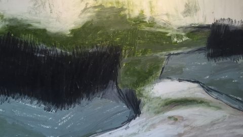
- The Watercolour studies below demonstrate what watercolour sets are so useful for; working quickly outside! I’m based in North Yorkshire and it has been freezing and very windy and wet, so I haven’t been able to do as much work outside as I would like…these studies really are very quick indeed; each one taking only a few minutes to do. Really they are colour notes and capture the essence of a landscape I want to paint. I find these really useful then, as studies to work up into more considered pieces, but to be honest I also quite like them for themselves, as I feel they have a freshness and life about them.
I always have at least three pots of water on the go
My studio overlooks a little beck, and I have a family of Moorhens which live down there and mooch around happily in the shallows…each of the sketches above took probably a minute or so to do, just using a few strokes of a round brush.
Watercolours are great for skin tones-play with browns and reds using plenty of water to create natural looking colour.
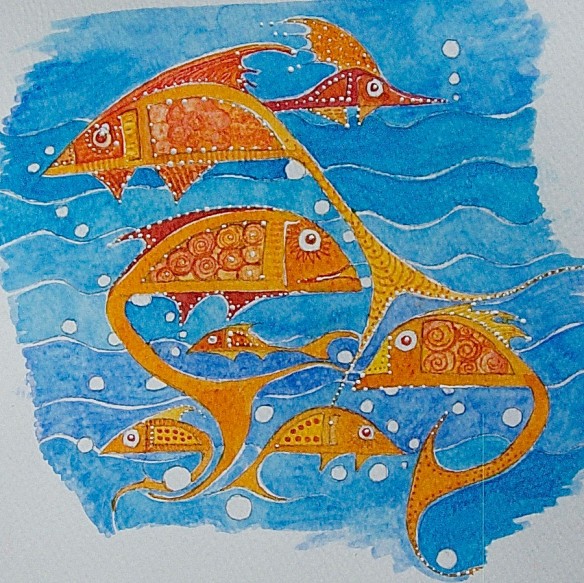
Watercolour idea for surface pattern design
Watercolours are also great for developing more illustrative work-in the sample above I was playing with an idea for a surface pattern design. This piece uses layered washes with overlaid linear pattern work and scratched out detail. I also added white gouache for highlights.
Sketch of vertebrae with tinted washes.
It’s also worth experimenting with watercolour washes for tinting drawings. In this sketch of some vertebrae, soft tonal washes were added to bring the drawing to life. If you are going to add washes to a drawing avoid using a very soft pencil which will tend to ‘bleed’ into the wash.
My Materials* list:
-
Gerstaecker Aquarell Fine Studio Watercolour-set of 24 large pans code: 33802
-
I Love Art Watercolour Pad 300 gsm watercolour paper code: 44221
-
Gerstaecker Kolinsky Watercolour Brush size 6 code: 71940
-
Gerstaecker Kolinsky Watercolour Brush size 10 code: 71942
-
Set 3 Synthetic Squirrel Brushes-Round code: 44582
-
Natural Sponge code: 23238
-
Paper Fixing/Gummed tape code: 22161
-
Daler Rowney System 3 Short Flat Brush size 3/4 code: 83375
-
Jaxhair Wide Brush( For stretching paper-I used a really old brush but this is ideal) code: 72720
-
Winsor and Newton Colourless Art Masking fluid code: 30693
-
White Oil pastel for resist-Caran D’Ache Neopastel code: 26890001
-
White pencil, Caran D’Ache Pablo code: 27730001
*All available from GreatArt Uk»
I Also Used:
-
A wooden drawing board for stretching paper-wood or sealed MDF is fine.
-
Hairdryer for speeding up the drying process! (NOT for stretching paper though!)
-
3 pots for water-I use a range of old glass jars and plastic cups!
-
Paper towel, paper tissues and cotton buds.
-
Hand wash soap for washing up
-
Small flat blade screwdriver, awl or needle, scalpel or craft knife.
-
Coarse sea salt
- And to finish…some artists to look at for inspiration:
-
JMW Turner-obviously!
-
Albrecht Durer
-
Georgia O’Keeffe
-
Paul Cezanne
-
Contemporary watercolourists; including Stephanie Tuckwell, Carol Robertson, Barbara Nicholls and Alf Lohr, Fay Ballard, Richard Bawden, Janet Kerr, Martin Leman and Thomas Plunkett.